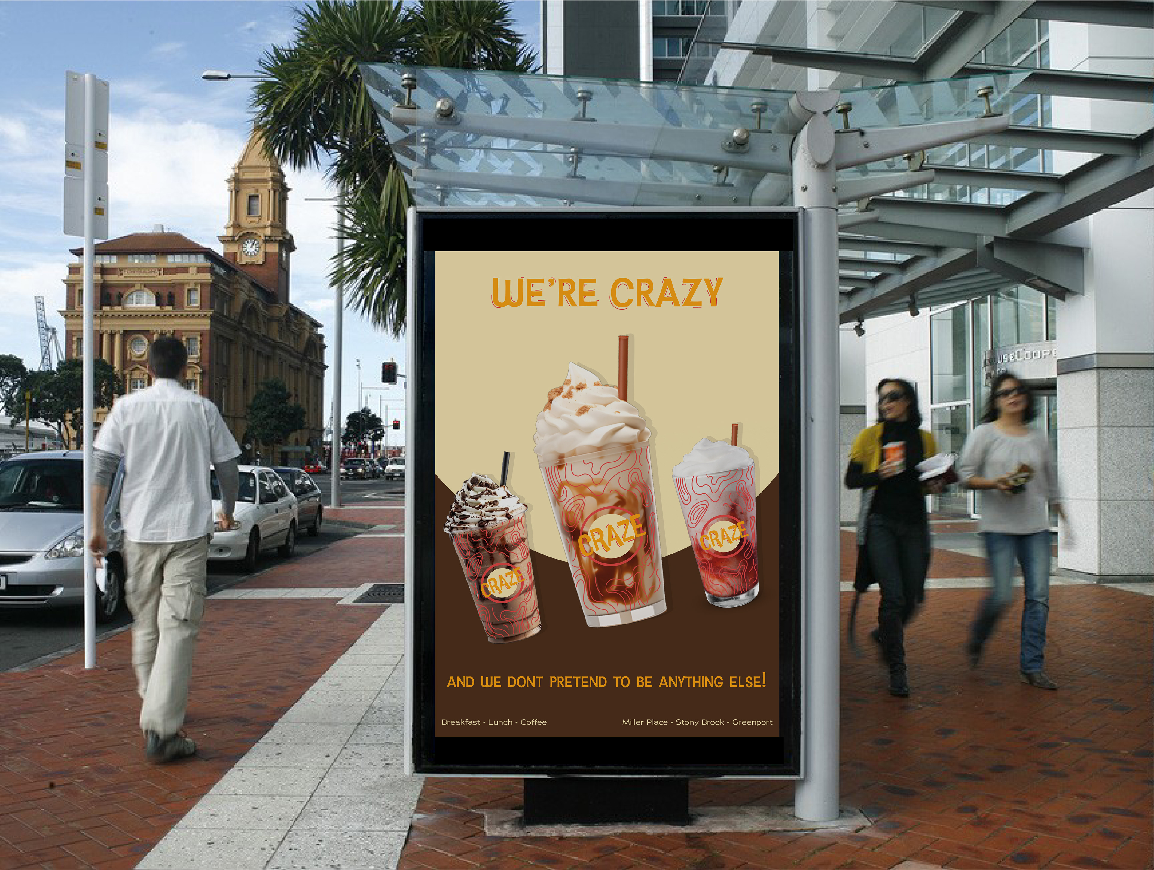
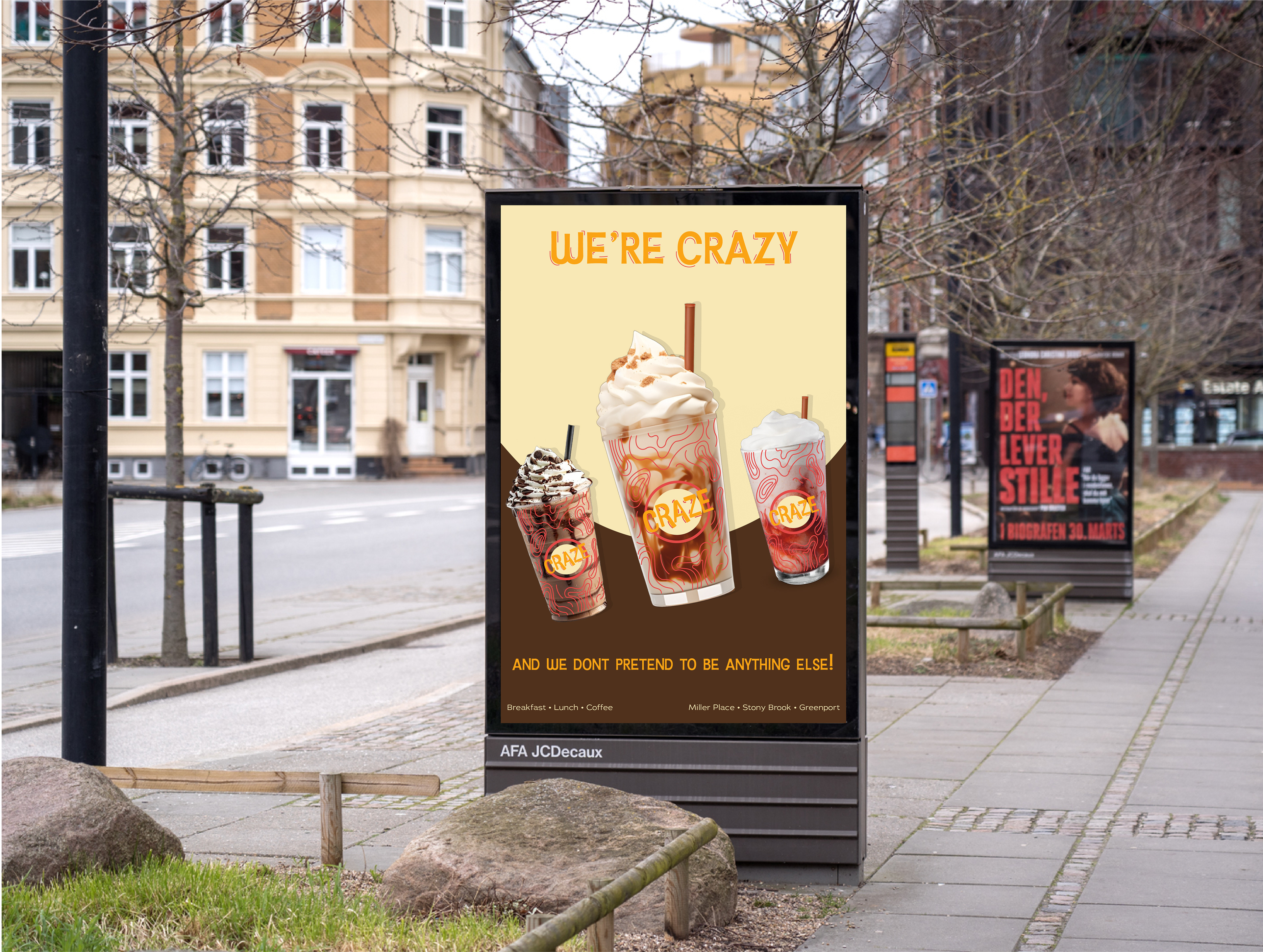
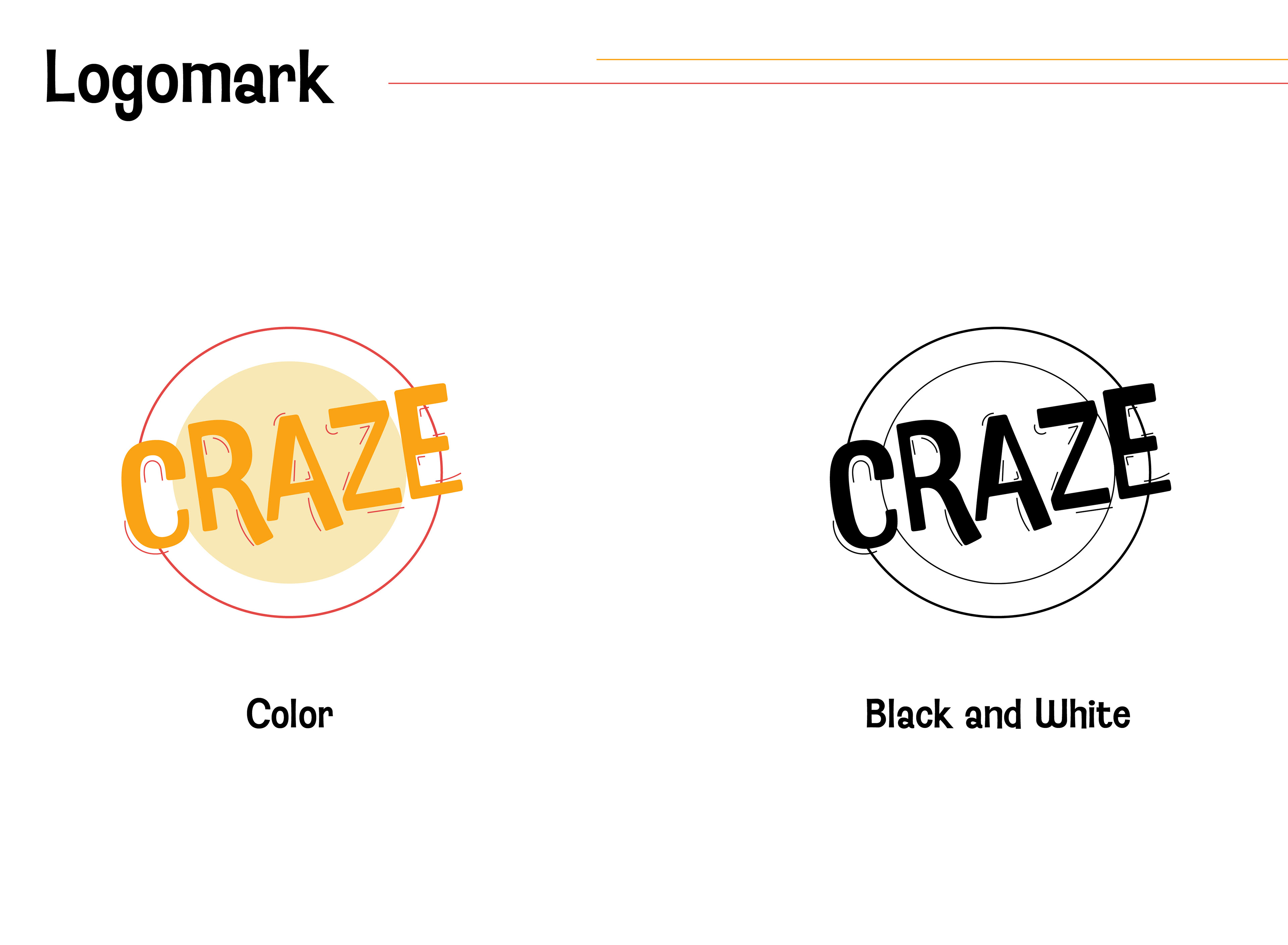
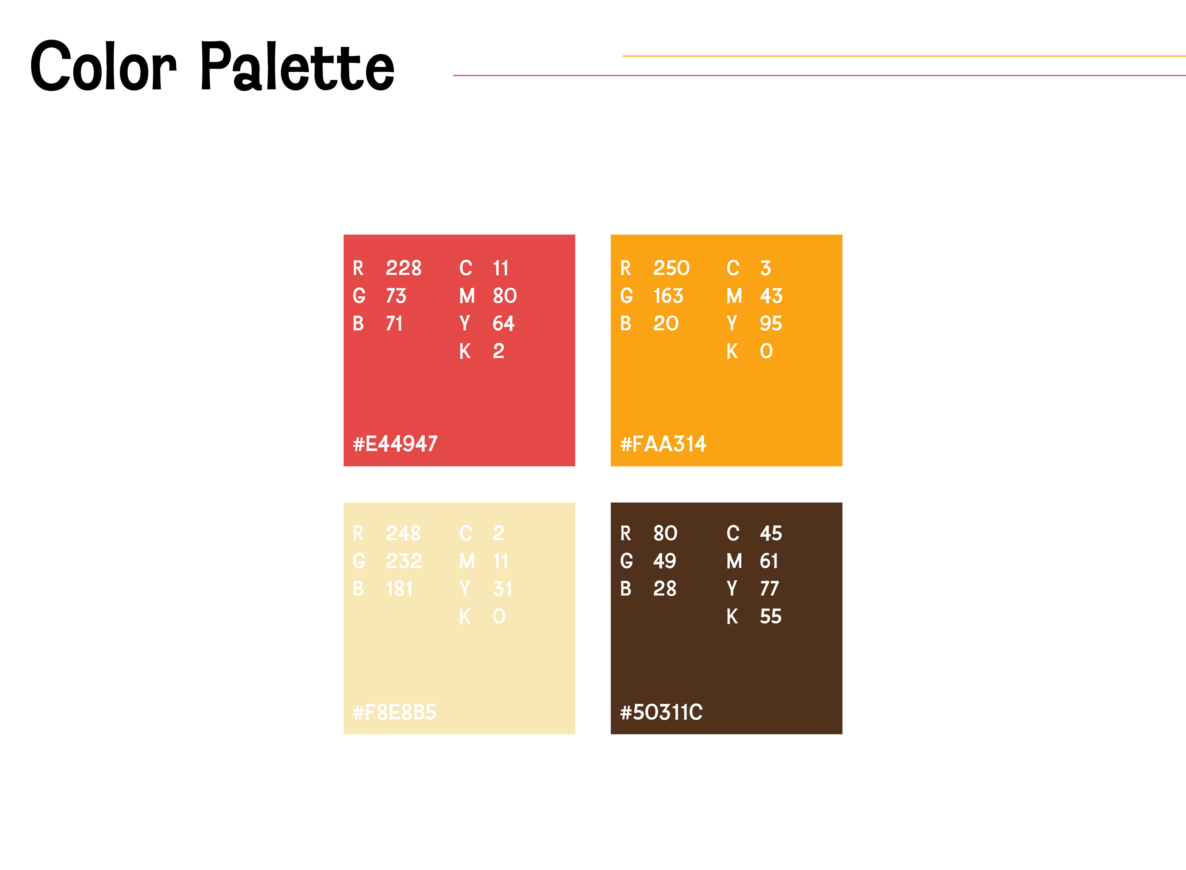
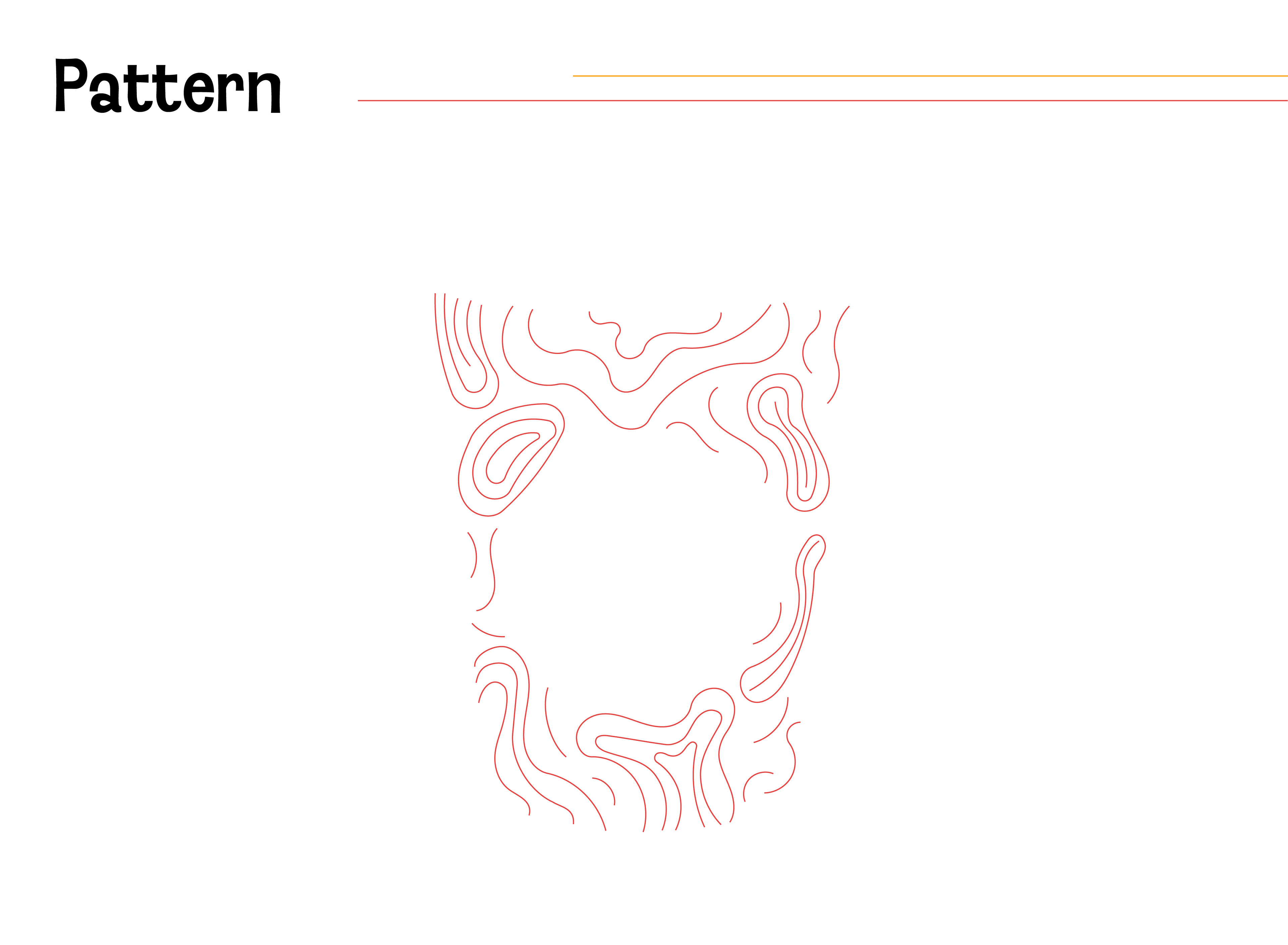
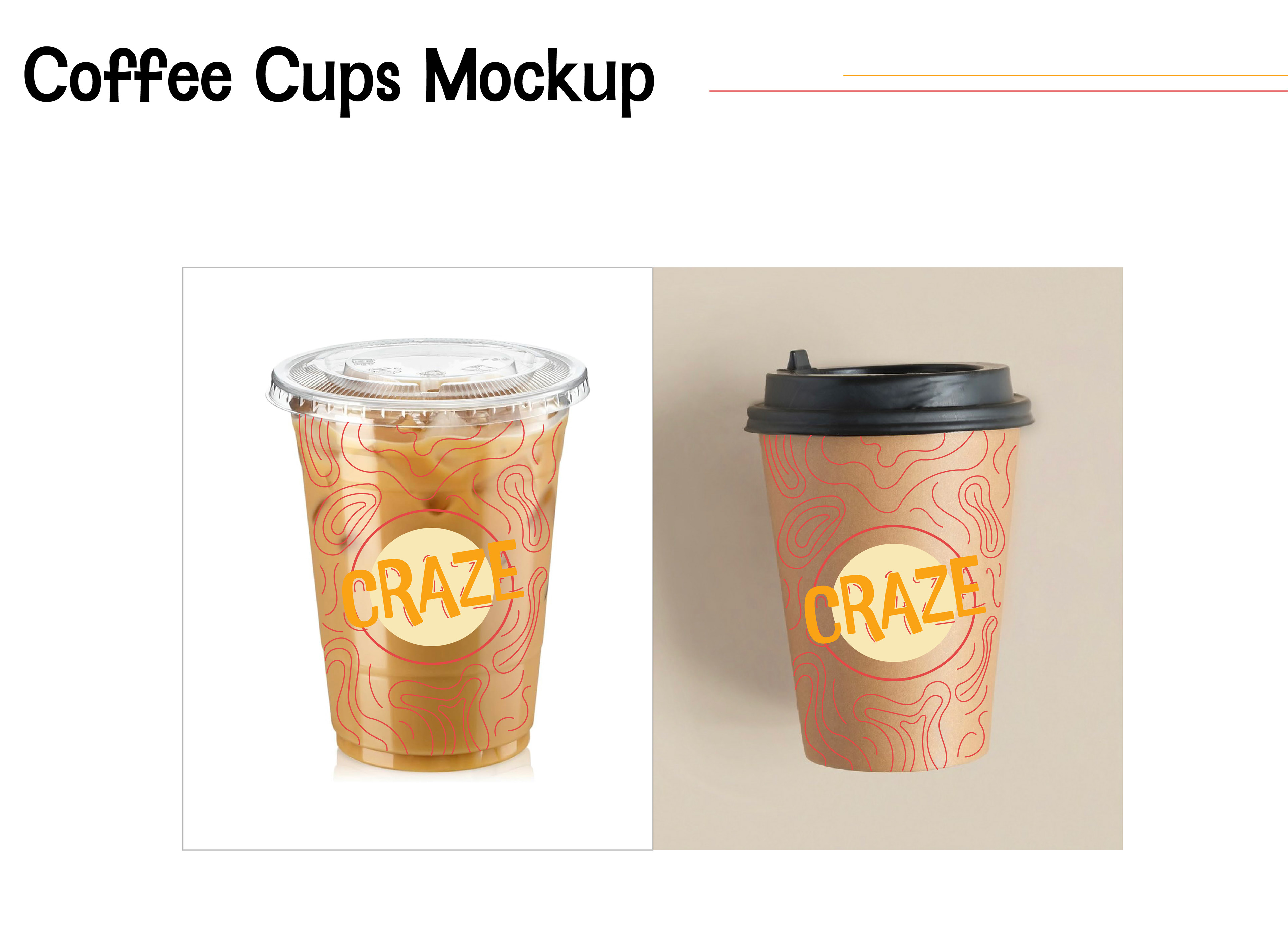
These brand guidelines were created in Adobe Illustrated for an assignment to rebrand a Long Island coffee shop. We were given a list of shops, and I chose a restaurant/coffee shop called Crazy Beans. I decided to simplify the name to Craze to create more impact and spark curiosity. For the new logo, I chose a font where the letters didn’t perfectly line up to emphasize the crazy and playful identity of the brand. I also added lines around the letters to create a sense of movement, further emphasizing “crazy”. I updated the brand’s color scheme by choosing a brighter red and orange and added two more neutral colors to balance them out. I also added a line pattern to the coffee cup itself to tie in with lines of the logo. This pattern also creates a dynamic visual that could capture potential customers' interests. For the poster, I decided to keep a simple design to allow the “crazy” drinks to become the focal point. For this rebrand, I created a modern design that could compete with popular coffee shops while paying homage to the physical diner aesthetic of the shop.
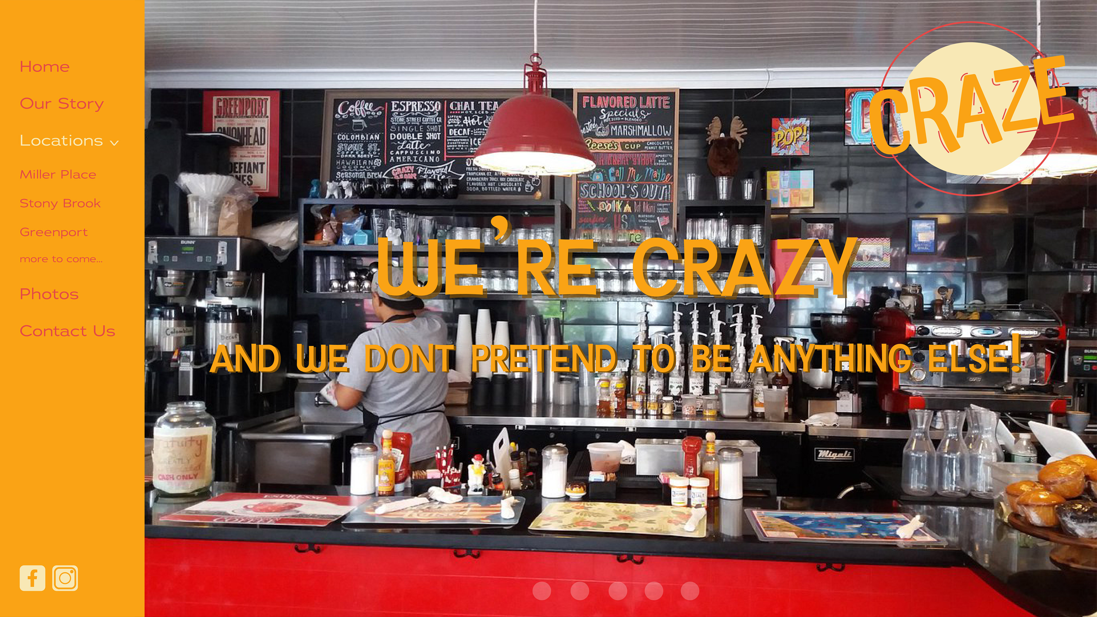
Website Homepage
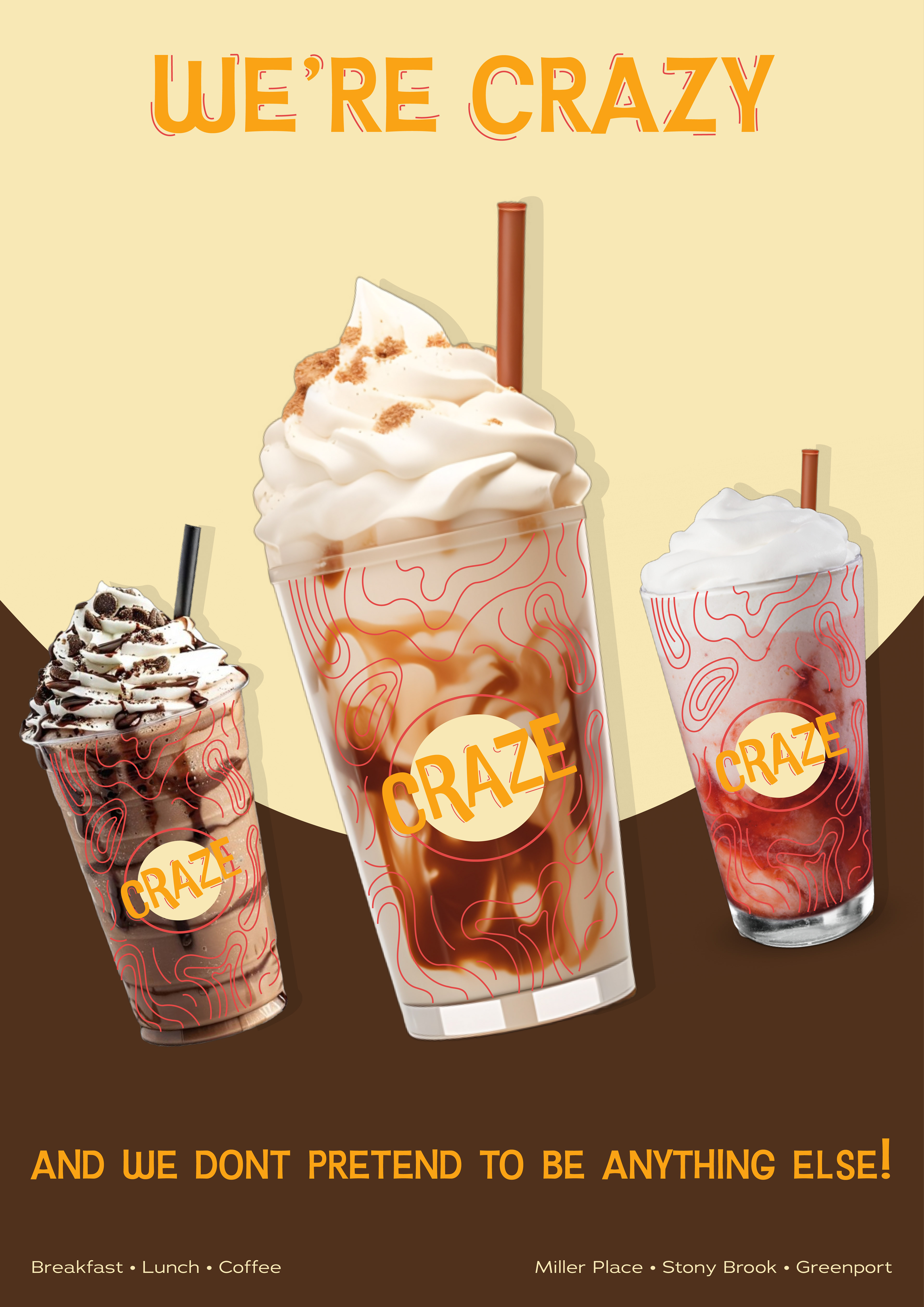
A2 Poster
